


During the height of the pandemic, Christina Scheffel, a high school English teacher in Delaware, was desperate for ways to get students engaged in her presentations. As a solution, she started adding embellishments to her slide presentations, including cactus themed slides with cactus borders, font and arrows. “Every single cactus emoji that I could find got put somewhere on these slides and I really did think it was a way to bring some joy into the classroom,” said Scheffel.
Students enjoyed the novelty, but later, when Scheffel asked them to recall information from the presentation, one student said something that made her rethink the way that she made all of her presentations going forward. ”One of my students looked at me and said, ‘All I remember from the last lesson is the cactuses on the slides,’” she recalled.
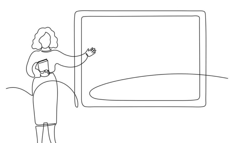
Designing visually appealing materials, like slides and worksheets, is easier than ever. However, Scheffel noted that too much decoration can distract from learning. She invited teachers to consider the universal design for learning principle of representation that asks teachers to present information in a way that makes it accessible to all learners. Scheffel provided useful tips for keeping classroom materials clear, accessible and focused on learning goals at the International Society for Technology in Education 2024 Conference.
Choose a design that works for students
Scheffel emphasized the importance of reducing cognitive load, the amount of information students can process at a given time. When slides have too many distractions like GIFs or irrelevant images, “we are asking students to take that extra processing step and therefore we are increasing their cognitive load,” said Scheffel. For that reason, teachers may want to be especially attuned to how they format slides with important information. Jeff Kilner, a technology integration specialist for Indian River School District in Delaware, said he benefited from putting the most important information in the foreground of slides so students have a clear idea of what to prioritize.
Scheffel also suggested checking design choices to ensure they support learning. Teachers can make sure that the font style and size is easily readable for all students in the room. Additionally, teachers can check to see if the color combinations in their materials are easy to read by using a contrast checker guide.
Limit text on slides
Slides packed with information can overwhelm students. “The language center of the brain doesn’t work that way. You can’t read information and listen to information and process both at the same time,” said Scheffel. “If our students are overloaded, they can’t learn effectively.” Grouping together related information can ensure that students are not being asked to do or learn too much at once. This approach, also called chunking, makes it easier for students to move new information into their long term memory.

Why Career Pathways Can be Clarifying
Ideally, students take a sequence of three or more courses in fields like healthcare, construction or education. Many also earn...

Schools and States Are Now Setting Limits on Screen Time for Students
The move is an about-face for a district that, since the pandemic, has focused on bringing technology into the classroom....

Feedback Bias? How AI Adjusts Replies Based on Race and Gender, Research Finds
The AI models addressed female students more affectionately and used more first-person pronouns. (“I love your confidence in expressing your...

Do You Like AI Because AI Likes You? How AI Flattery Crosses Signals
“We haven’t really had this kind of technology for very long,” she says, “and so no one really knows what...